The Herzog/Kinski box set is probably my favorite ever. While far from being the biggest, it was in many ways a personal, creative, and financial success.
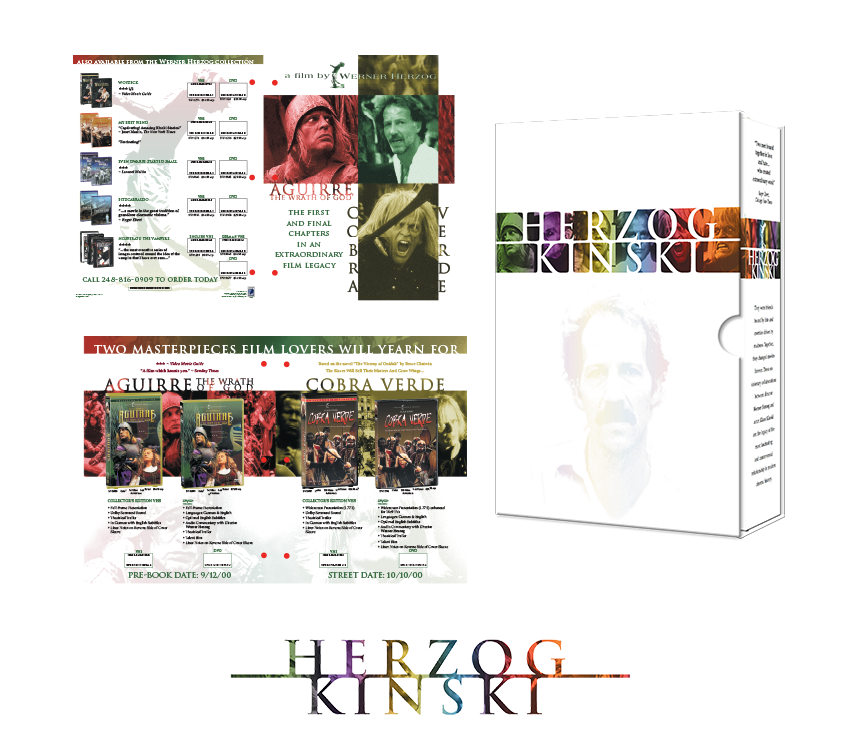
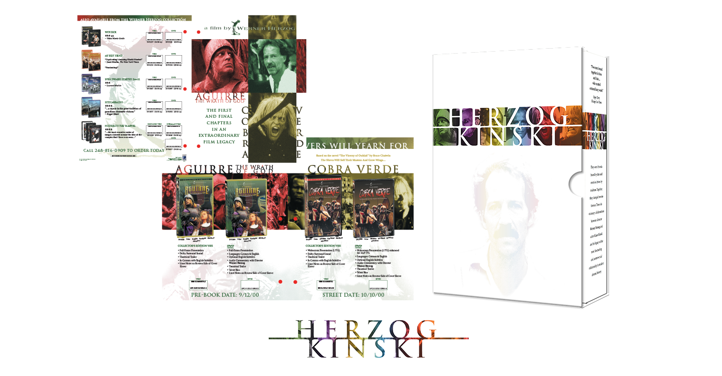
The roots of the project began with a flyer for a couple of projects I had worked on. The flyer was for the release of the Werner Herzog/Klaus Kinski collaborations, Aguirre, the Wrath of God, and Cobra Verde. The typical flyer format at that time was pretty simple, 3D pack shots over a simple background, often a still, texture or gradient, with stills from the movie as insets, plus all the standard copy points
I designed a flyer pretty much like that but was really bored by it. I wanted to do something with a more interesting design sensibility, something that used color and type and negative space in ways we typically didn't. So I did a second version. And it worked, when VP Jay Douglas saw it, he loved it, and that was all the support it needed. It was a nice victory. I had shown I was more than just a pair of hands, and I had upped our game a little.
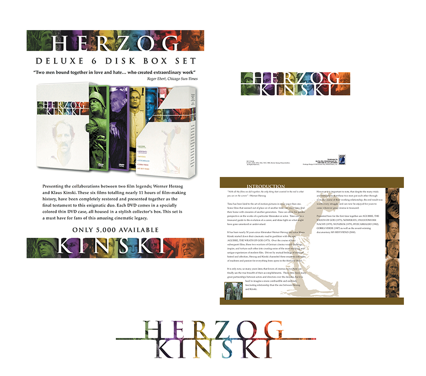
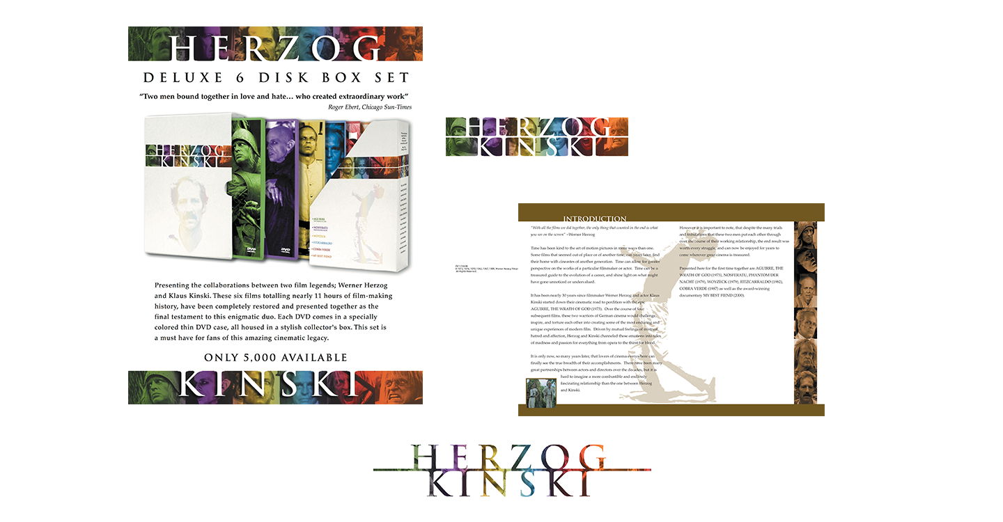
The story could have ended there with a single win, but it was just the beginning. A few years later, Anchor Bay was planning on releasing its 6 Herzog/Kinski films as a box set. Normally we would have just put existing DVDs into a new box. One of my co-workers Michael Felsher really wanted to do something different, something more collectible, something that could encourage people who already owned all, or some of these releases to buy them again. There was no money for new content, so the only option was packaging. We has recently gotten samples of a new packaging option, that were thin plastic sleeves that held DVDs. They had very small spines so they didn't look good on a shelf, but they would be fine in a box, plus they would give the box a smaller footprint making it more appealing at retail. Michael had a software box that consisted of an inner and outer box. This really has some heft and made it feel really solid. A box like this along with the thinpacks all wrapped in a very classy design could be a very nice premium product that really didn't cost a lot to produce.
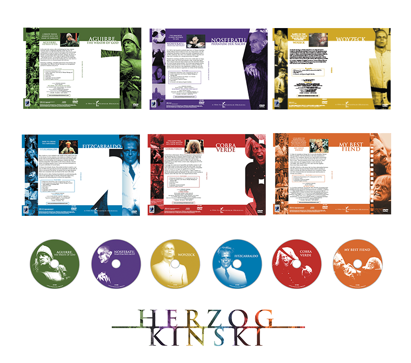
There was one problem, while the project was scheduled, no one was actually working on it yet, and neither of was really responsible for such projects. We did this on the side. I went back to the flyer for inspiration. I mimicked how it used large white areas and strips of photos. The flyer had assigned colors to its two films, but since the box set has 6, I did a whole spectrum of colors, one for each film. Each sleeve design would be monochromatic but consistent, as far as the overall design. Each with a large key image of Kinski in a silhouette shape tied to some aspect of each film. Top it of with matching monochrome disk art, and a booklet featuring liner notes, and we had ourselves a great little box set. Unfortunately it didn’t officially exist yet.
I built a pretty well realized mock-up. I worked with our printer to develop all new templates, as we had never done a box like this before. We worked up a pitch, and came with what we were sure was a pretty compelling argument for why we should do a more expensive premium project instead of a standard box set, and took it to Jay, since he really made the flyer happen. Jay saw the box and in all of 5 seconds said. "This looks like a music box set, lets do it". No pitch needed. We were almost a little disappointed that we didn't get to make our very well reasoned pitch, but we didn't look a gift horse in the mouth.
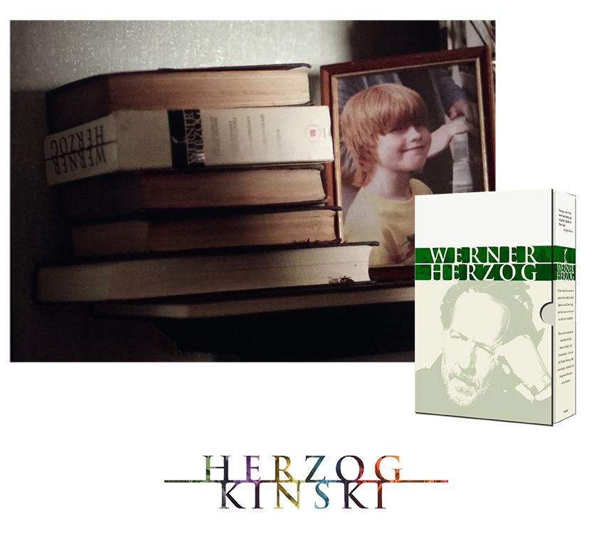
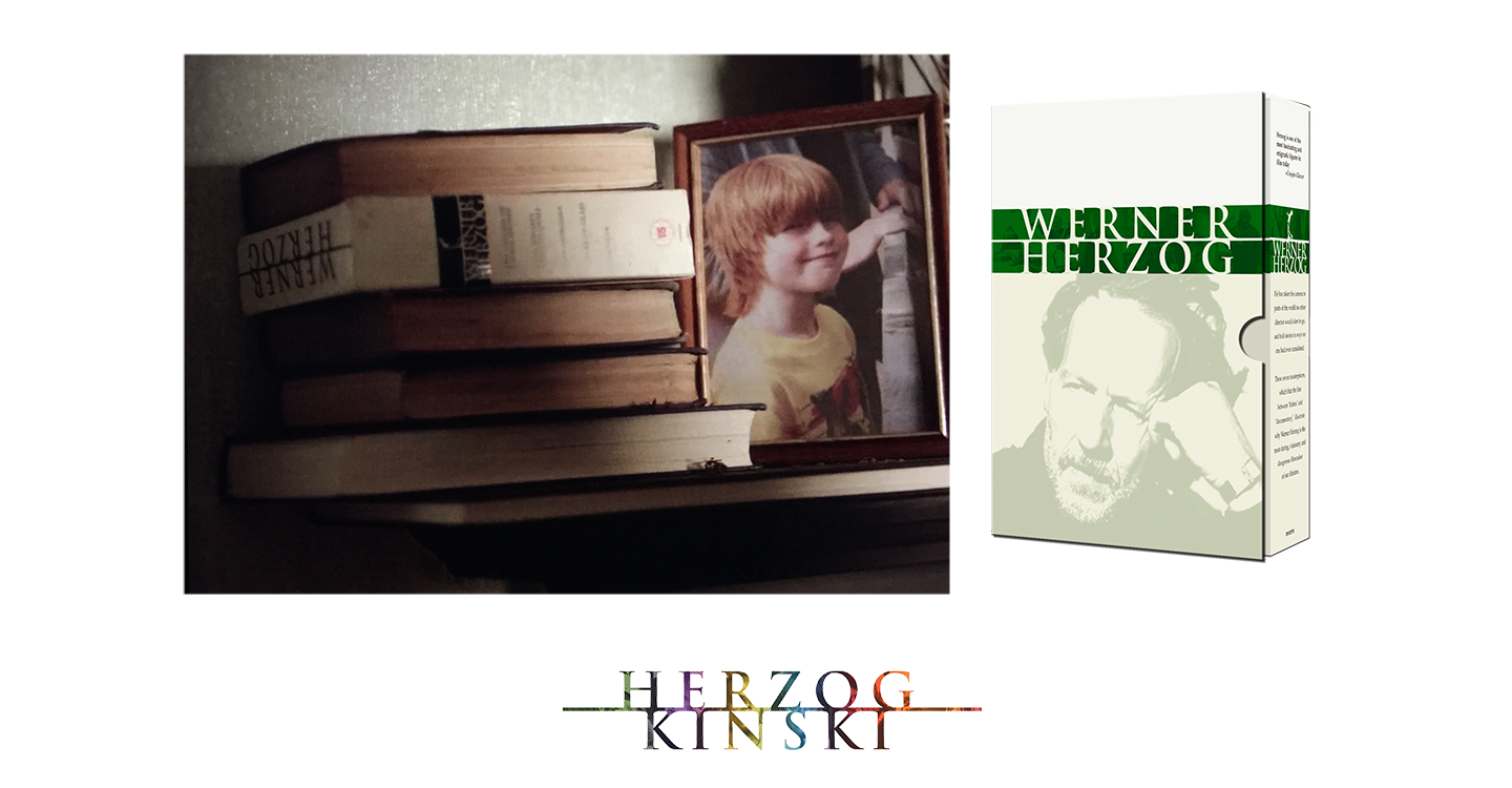
The initial projections on the set were that it would sell 5000 units. It sold out immediately, as well as nearly 2000 extra made from overprints. We would go back to press several times, and it would stay in print for years, doing especially well at retailers like Borders and Amazon. In the end it sold over 50,000 units. It was very well reviewed and even won an award. A second box set featuring more Herzog films would follow, using a complimentary design scheme. On of my great joys was seeing the UK release of that Werner Herzog set in the background of a scene from the Netflix science fiction series Black Mirror. It was prominent set dressing in a shot. It would of been nice if it had been the original Herzog/Kinski set, but it's color scheme wouldn't have fit the shot, so it was a smart visual call, and still a joy to see it on screen. It was one last little gift from my favorite project.

Home • Design • Illustration • Resume • About • Contact
Website © 2017 Dot Screen Studios, LLC. All rights reserved.
All artwork and properties within are © and TM their respective owners

